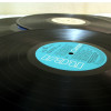
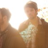
 Kanadiečių electro pop dueto „Junior Boys“ kūrinį „Banana Ripple“ buvome pristatę dar pavasarį, kai tik ši daina buvo išleista pirmuoju naujausio kolektyvo albumo „It‘s All True“ singlu.
Šiandien 9 minučių kūrinys turi savo vaizdo klipą, kurį režisavo Rollo Jacksonas. Vaizdas – viršuje.


Most people are warm and fuzzy about the first logo baeucse they read the backstory on what the elements mean. Without it . . . it’s just a multicoloured ring of fire/feathers.Modern attention span does not allow for this heart-warming tale to be told, and there is nothing within its design that encourages people to find out more. It is almost too clever something that we as designers must learn to curtail.Like a joke, if you have to explain it, it didn’t work.The winning design, although to me not aesthetically appealing, conveys much more information in the first glance than you might expect.For instance, Sochi is in Russia. Would anyone even know that from the first logo? All too often we assume the viewer has knowledge, but in this case how much does the wider world even know about Russia?As for the crystals, I think they are genius. This one design element is so incredibly flexible, and if used correctly, it can create an association with the logo and the event that can be used literally anywhere.Anyway, these are my thoughts. Not conventional I know, but convention is what holds us back at times.